What's New With XL?
XL integrates hardware and software into one seamless package to drive improvements in manufacturing productivity, including highly accurate production data collection and a real-time plant floor display to inform and motivate your operators.
The most important feature of XL is EASY. Our goal is nothing short of making it incredibly easy for you to collect key real-time production data and improve your manufacturing productivity.
Our newest software (version 2.0 and higher) runs on an entirely new hardware platform, explicitly designed for the manufacturing industry, with an order of magnitude increase in processing power and an entirely redesigned data model. For existing XL customers, drop-in hardware upgrades are available; however, data and configuration are completely new, so they do not port across. Original purchasers may upgrade XL units from the previous hardware platform for a highly discounted rate of $695 each. Compare versions or read below about latest release features.
2.19 (Preview)
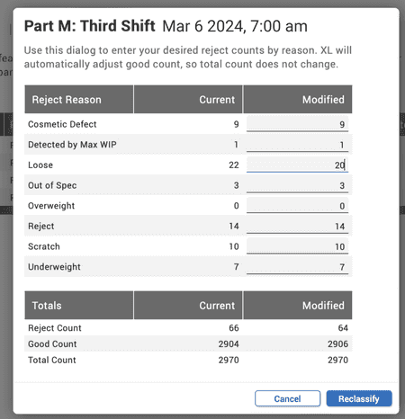
Reclassify Counts
QA any time, reclassify any time.For some processes, reject counts and/or their associated reject reasons are not determined until after a shift or part run has been completed. Now, you can retroactively reclassify counts, which is most commonly used to reclassify some good counts as rejects. This is especially valuable for companies that have post-shift inspection and QA.
It’s really easy to use. Simply adjust your reject counts (by their associated reasons), and XL automatically evenly distributes reclassified counts throughout the selected part run. This feature makes it very easy for you - no complicated math for you to deal with!
HTTPS on Your Local Network
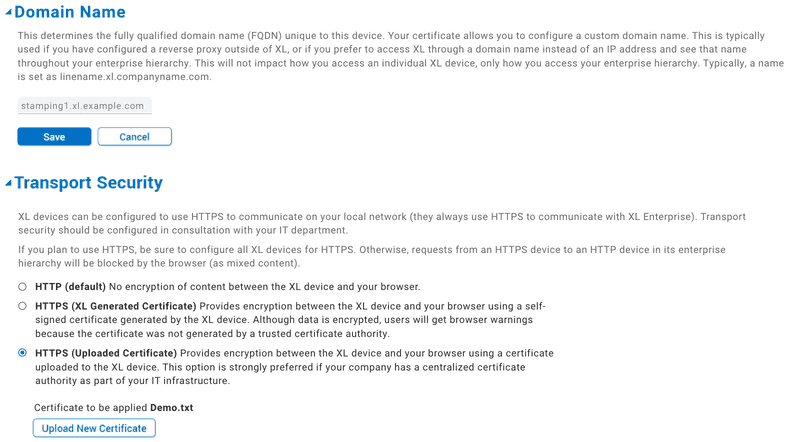
Certifiably qualified.While XL has always used HTTPS to communicate with XL Enterprise, now XL can also use HTTPS within your local network. An increasing number of manufacturing companies are operating their own certificate servers, so we added this feature to provide you with an additional layer of network security.
This can be implemented in two different ways:
- Upload your own SSL certificate to the XL device or
- Have XL generate a self-signed SSL certificate for you.
If you have the IT infrastructure to support it, we recommend uploading your own SSL certificate.
A related feature is that you can now assign Fully Qualified Domain Names to XL devices, which makes accessing your XL device easier - you can access them by name instead of by IP address. You can also use the domain names in your enterprise hierarchy.
Archive Reasons
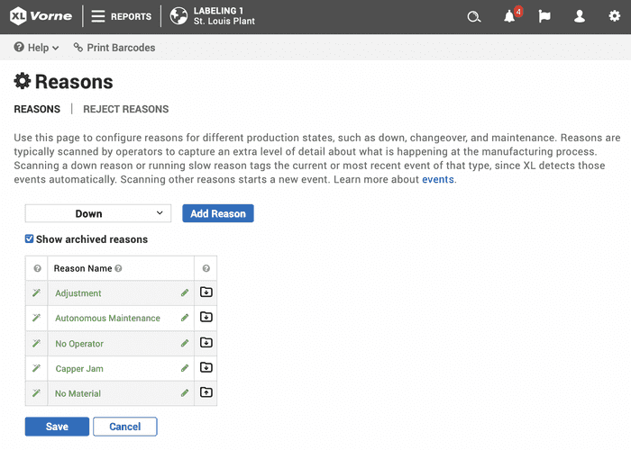
Your reasons make history.If you’re looking forward to fresher, cleaner reason pages, this feature is for you! Maintaining a highly curated and focused list of reasons is easier than ever because you can now archive reasons.
Archiving a reason prevents it from being used for new events but ensures it will still appear in historical reports. This is helpful if you want to deprecate reasons that are no longer in use. Of course, you can still see archived reasons in your historical reporting.
Archive a reason on accident? Decide you really like the reason that you archived a while back, after all? You can also restore a reason that you have previously archived with a click of a button.
New Software Notification
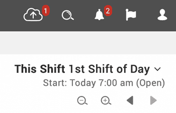
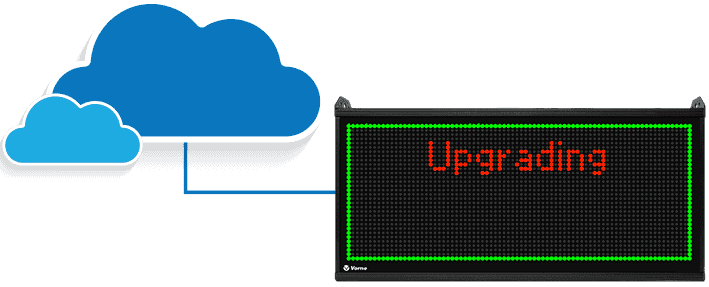
Never miss out.We have updated the App Bar to ensure you won’t miss out on any valuable new XL features. The new cloud icon alerts you when new software is available.
If you are logged in as an administrator, you’ll even see a link that leads directly to the Update Software page where you can learn more about the new features and initiate the update.
See the cloud. Initiate the update. Enjoy the features. It’s that simple!
OS Updates
You might not see it, but you’ll like it.We’ve done a LOT of work under the covers to enable easier, faster, and more robust updates to both the operating system and the XL application software.
Amongst many other benefits, a streamlined update framework makes security updates simpler and faster – a feature of fundamental importance for manufacturing.
These enhancements require no additional setup - it’s automatically handled for you as part of the 2.19 update package!

Start Shift Endpoint
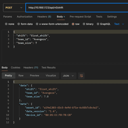
Our API is free, no tokens needed.Manually begin a shift with the new Start Shift endpoint. You can now start Shifts via the XL API without needing a configuration token. This makes it easy to integrate external time schedule systems with XL.
2.18
Enterprise In the App Bar
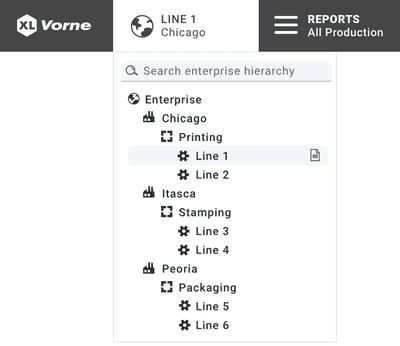
Expand your manufacturing worldview.The App Bar now features an integrated enterprise control, which enables you to specify any work center, area, site, or the entire enterprise as the source of data included in whatever report page you are viewing.
With this new feature it is both easy and intuitive to explore your data as you seamlessly move across and between your enterprise hierarchy and the extensive portfolio of reports and views. You can fluidly work your way from your entire enterprise all the way down to individual events at individual work centers.
To help you get the most out of this feature, we have extensively updated built-in report pages with new controls and features for exploring your data:
- A new table found in most of the Analyze reports shows a breakdown of the top-of-page KPIs by site, area, or work center for easy comparison.
- Hierarchical tables now have additional levels of hierarchy for enterprise nodes that show rolled up data at the selected level all the way down to individual work center events.
- Time-based charts align multiple work centers on production day, ordinal shift, and shift hour to enable more meaningful aggregation of data.
- Column and Pareto charts can now be stacked, where the stacked element is selected using the enterprise dimension row control (site, area, or work center).
- KPI sparklines are enterprise-aware and show aggregated trend data.
- Tables and charts now have a dimension control with defaults coordinated to the App Bar. For example, if you select your enterprise in the App Bar, charts and tables will show a breakdown by site.
These changes make built-in reports even more powerful - and don’t forget that the new App Bar Enterprise control also works with dashboards (i.e., custom reports).
Reports Menu Shared Dashboards
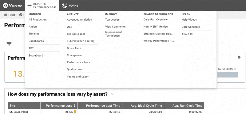
Click less, share more.We added a column in the Reports menu for Shared Dashboards so you and your team have instant access to any custom reports you create and share using the Dashboards feature.
Shared Dashboards are listed in order of their names, so if you would like a specific dashboard to be at the top of the list, simply start its name with a number. If you have more shared dashboards than will fit in one column, click “More…” at the bottom of the list and you will be able to see and select from up to 50 shared dashboards.
Managed Software Updates
Everything new. Everything in your control.This release starts to equip XL devices for managed software updates. This means later this year you can use XL Enterprise to decide where and when to apply software updates:
- Where: Select a work center, an area, or an entire site.
- When: Select an immediate update or schedule an update for the future.
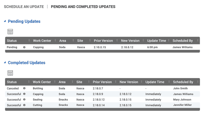
You can also monitor pending and completed software updates in XL Enterprise (as shown in the image below).
Modify Past Production States
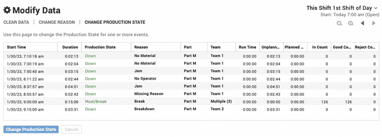
Mistakes happen. Now so do corrections.Now you can go back in time to change historical production states. Specifically, you can change any non-run production state (e.g., down) to any other non-run production state (e.g., changeover).
As an example, if you have work centers where operators manually scan changeovers, and they forget to scan, you could end up with a down event instead of a changeover. With XL 2.18, it is now very easy to “fix” the data.
It is worth mentioning that XL already includes several features to help in the above scenario:
- If your part runs start with a changeover, XL can be configured to automatically start the changeover with the part run and automatically end the changeover when it detects that the process is “definitely running.” No manual scans!
- XL can also detect short down events before changeovers and automatically convert them to be included in the changeover. Automatic data corrections!
Introducing Spark Dimensions
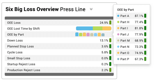
Spark deep insights.The all new spark dimension enables you to visualize multiple dimension values in a meaningful and compact format. Choose from three styles: chronogram, bar chart, and column chart.
- Chronogram: Each element in your mini-chronogram represents one event of your selected dimension. This is best for a visual representation of dimension values over time.
- Bar Chart: Each element of the bar represents one aggregated dimension value. This is best for comparing dimension values (e.g., run and down) across different events (e.g., shifts).
- Column Chart: Each column of the mini column chart represents one aggregated dimension value. This is best for comparing dimension values to each other (e.g., which part had the best OEE).
Spark dimensions provide a simple way to visualize information so you can scan for what is most important and make quick comparisons.
Email Report Enhancements
Your reports, your way, on your timeline.We’ve added three enhancements to email reports:
- In addition to shift reports, you can now choose to have reports emailed to you on a daily, weekly, or monthly cadence.
- Email reports now have a more detailed and scannable subject line containing the title of the report, the enterprise node (work centers) to which it applies, and the span of time it covers.
- Individual tables can be configured to show as many as 25 rows, such as for Availability Events, Availability Reasons, and Reject Reasons.
This feature package is yet another example of how XL delivers the right information at the right time, so you are in the best position to effectively drive improvement.
Andon Widget Enhancements
The possibilities go on And-on.We’ve added two new live controls to the Andon widget - even more versatility for a widget that our users already love.
The Filter control enables you to apply metric and dimension filters to the Andon page and widget.
- Apply a metric filter to display a subset of Andons, such as work centers that are poor performers: “OEE < 70%.”
- Apply a dimension filter to display a subset of Andons, such as excluding work centers that are not scheduled for production: “Impact ≠ Not Scheduled.”
The Dimension control enables you to choose the dimensions you see in the Andon footer, such as in this example that shows Part and Job.

Dimension Tooltip Enhancements
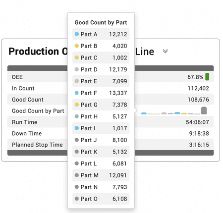
Learn more in less (space).We’ve enhanced the look of dimension tooltips, made them easier to read with row banding, and we’ve added metric values to make them even more informative. For example, if you have a spark dimension column chart in a table, and you see something that peaks your interest, use the tooltip to get specific details.
Automatic Planned Stop Conversion
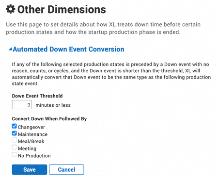
We interrupt your regularly scheduled meeting.Vorne XL can already be configured to automatically detect short down events before changeovers and based on “smart criteria,” convert them to be part of the changeover. Now we’ve extended this feature to maintenance, meal/break, meeting and no production events - all under your control.
Enterprise-Aware Event Lists
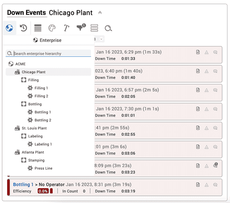
Stay in-the-know, enterprise wide.The Event List widget is a great way to explore production, utilizing a vertical timeline where time is organized by whatever production- or time-based dimension you choose.
Now the Event List widget is fully enterprise aware, so you can see events and related data (loss report, rejects, comments) across areas, sites, or the entire enterprise.
Real-Time Data Endpoint
Satisfying the need for speed.Our users love that XL generates 100+ metrics in real time. Now, in XL 2.18, we are extending real time even further - to integration and third-party tools.
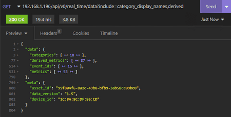
The new real_time API endpoint enables you to query metrics for the shift, part, and hour, with blazingly fast response times: under 100 ms is typical. You also have options in the API to include derived (i.e., calculated) metrics and names for dimensions. In our example, you can see that 804 lines of information, consisting of 18 dimensions, 53 core (i.e., stored) metrics, and 87 derived (i.e., calculated) metrics were returned in 19.4 ms!
Generating QR Codes
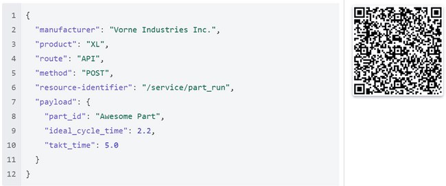
Spend your time scanning barcodes, not creating them.XL devices now respond to a simplified JSON text format for Job, Part, and Team QR codes. This new format only uses printable characters and does not require checksums.
This feature is especially useful for organizations that like to generate QR codes directly from their ERP or MES systems.
2.17
Custom Email Reports (with Multiple Work Centers)
Emails you will love to receive.Now you can customize shift reports that are emailed to you directly to you from XL Enterprise. Plus, you can easily include data from multiple work centers.
Laying out a custom email template will feel very familiar to anyone who has used XL dashboards, since we used dashboards as the model for laying out email templates. Simply add sections, select widgets (KPI, KPI Group, or Table), and configure them with live controls. You can then subscribe to reports generated from any email templates you create for whatever work centers you select. It’s easy. And powerful.
The KPI widget highlights the value of a single metric. When placed within an email template section, three side-by-side KPI widgets are automatically included so that they nicely span the width of the email.

The KPI Group widget shows values for multiple metrics in a compact format. Organize your metrics with headings and blank lines to create your perfect report. When placed within an email template section, two side-by-side KPI Group widgets are automatically included so they comfortably span the width of the email.
The Table widget comes in five varieties. Availability Events, Availability Reasons, Reject Reasons, and Part Run include one table for each work center. The Work Center table includes one row for each work center, providing you with a compact and customizable summary view of data with the ability to customize the metrics.

That’s it! Shift reports will be sent right to your inbox, configured exactly how you’d like, with data from whatever work centers you choose.
Filter by Enterprise Dimensions
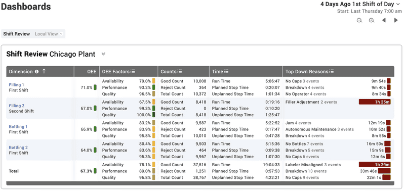
Dare to compare.One of our most highly requested features is filtering by Work Center. In this release we added filter dimensions for Site, Area, and Work Center. These filters can be used when creating custom dashboards and when analyzing production data with built-in reports such as Advanced Analytics. For example, in this Table widget, Filling 1 and Bottling 1 are combined in an aggregated analysis.
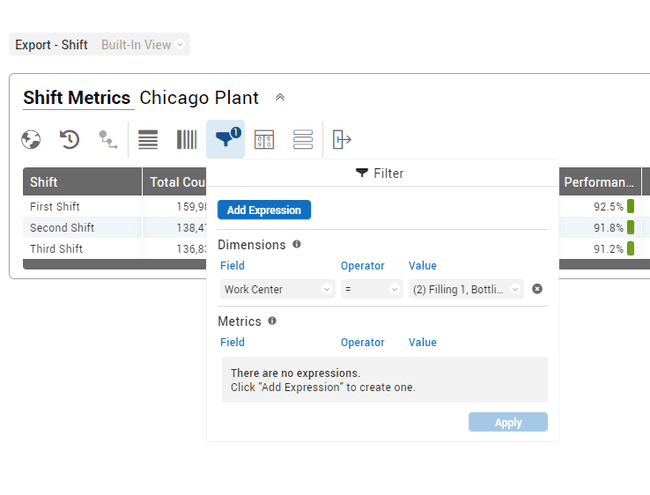
Chart Widget Time Units Control
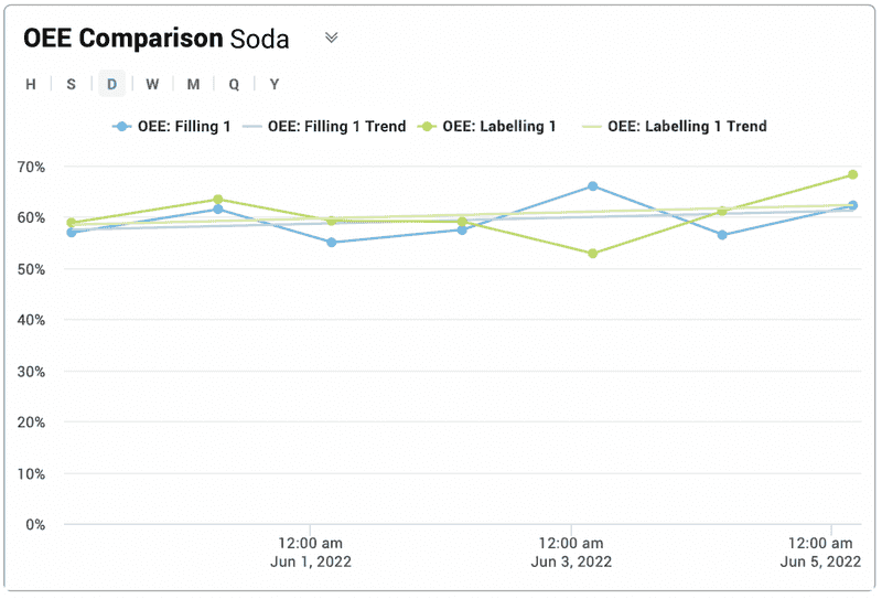
Controlling time isn’t just for superheroes.You can now change the granularity of time while viewing charts with a simple click of your mouse. This is a great feature for jumping between levels of detail. Go from fine-grained detail (Hours to Shifts) to the big picture (Days to Weeks) with a single click.
Ordinal Shift
Bring order to unaligned shifts.Ordinal shift is a brand new XL dimension that automatically numbers each shift within a production day (e.g., "1st Shift of Day"), which makes it much easier to align shifts across work centers. For example, if different work centers have a different number of shifts, ordinal shift enables easy, time-based alignment and rollup across work centers.
Ordinal shift has also been integrated with the Time Range Selector (TRS). The updated TRS still makes it easy to create dashboards that compare recent Shifts (e.g., "This Shift" vs. "Last Shift"), while adding the new feature of staying time-aligned across work centers when traveling farther back in time. In other words, when traveling more than three shifts back, the TRS aligns on production day plus ordinal shift, such as “2 Days Ago 1st Shift of Day.”
Scoreboard Blank Lines
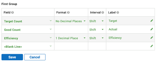
Less can be more.You can now configure one or more lines of your XL scoreboard to be blank. Simply go to Settings > Scoreboard > Fields, and choose "Blank Line" from the top of the Fields dropdown.
Why would you want to do this?
We are glad you asked! It is a great way to reserve scoreboard space for information from external systems. Our partner, Sulzer Consulting, makes fantastic products for integrating all sorts of systems with XL. For example, their PiXL application makes it super-easy to integrate information from other systems directly to the XL scoreboard. PiXL also comes with a library of graphics - or you can create your own.
2.16
Andon Everywhere
Welcome to the dashboard family.By popular request, you can now add the Andon widget to dashboard pages. Here are a few new and useful things you can do:
- Include the Andon widget in custom reports.
- Organize Andons into any groups or combinations.
- Mix real-time and historical Andon widgets on the same page.
- Show different metrics for different work centers.
- Replicate the “scoreboard” view across multiple work centers to create “digital signs.”
- Add a fourth metric to any Andon widget.

Quick Charts
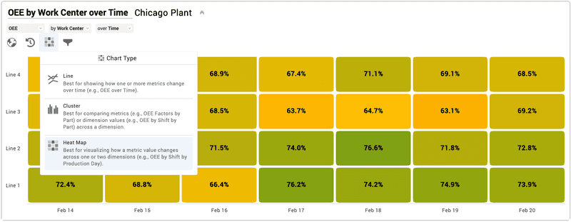
Chart smarter. Chart easier.The Chart widget now includes live controls and a feature we particularly love called Quick Charts.
With Quick Charts, simply select your metrics and dimensions, and XL automatically generates a “best practices” chart for you. For example, if you select “OEE” “by Work Center” “over Time,” XL will generate a Heat Map chart that shows exactly that. Want something different? No problem. Simply click on one of the alternate chart options suggested by XL. Line chart anyone? Cluster?
Not only does Quick Charts save you time - it intelligently selects a visual to match your data.
Enhanced Tables
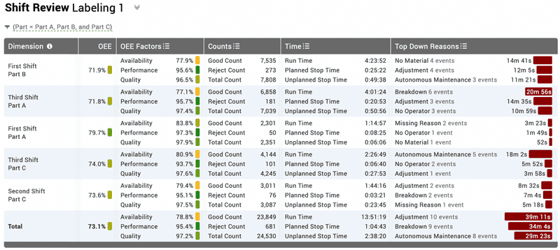
Clean presentation. Impactful information. Real-Time Production Data.Now you can combine any metrics you want within one table column, which is super handy for information-dense reports with multiple lines of data per row. But wait. There’s more. Lots more.
- Include a totals row.
- Specify the number of rows to show.
- Arrange columns with a drag-and-drop list that also shows how each column is configured.
- See metric sets together with metrics and explore them with tooltips.
- Stack row-based dimensions so you can use space more efficiently.
Event List Comment Search
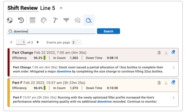
Search effortlessly. Scan quickly.First we added the comments feature. So, of course our customers added lots and lots of comments. Now, we have made it easy for you to find comments through a new search feature.
You can search across all comments for a work center within any time range you select. XL ranks the search results by “best match” and highlights the searched words to make it easy to scan through the results.
KPI Group Enhancements
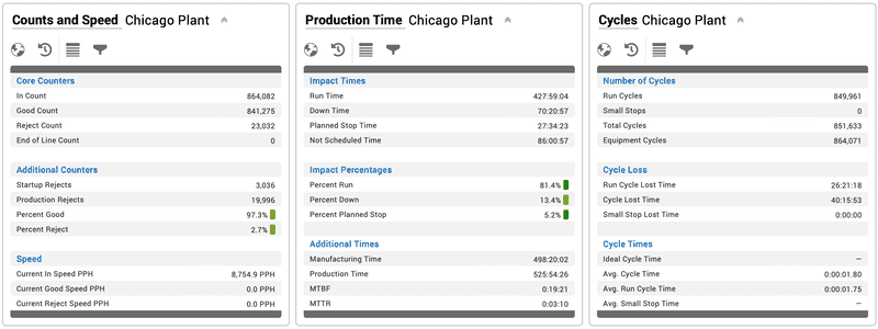
New look. More control.The KPI Group widget has a lovely new look and lots of new functionality through four live controls:
- Enterprise (easily select which work centers to include)
- Time Range (each KPI Group can have its very own time range)
- Row (quickly select metrics and dimensions, or create a heading)
- Filter (filter data to show exactly what you want)
Easier Parts Configuration
Easy import. Immediate change.Part configuration just got easier with import and replace, as well as immediately applying changes to currently running parts.
With import and replace, you can seamlessly replace your entire part configuration on a device, which is very handy when you want to make a lot of updates at the same time, such as changes to production planning. You can also directly delete individual parts.
With applying changes to currently running parts, when you save changes to part configuration for the currently running part, your changes will be applied instantly (i.e., to the current part run).

Visibility of Views and Pages
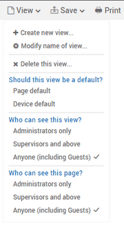
Show what you need. Hide what you don’t. Optimize for your manufacturing business.A frequent request from XL users is to have control over the visibility of views and pages. Now you can navigate to any view and choose:
- Whether it should be used as the page or device default
- Who can see the view
- Who can see the page
Speed and Rate Metrics
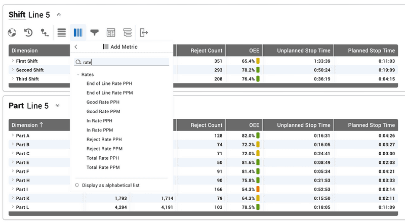
History in the making.XL now features two types of metrics that measure how quickly parts are being produced: Speed and Rate. Even better - both types of metrics are also available in historical analytics.
- Speed measures how quickly parts are produced while actually running (calculated with Run Time as the time base).
- Rate measures how quickly parts are produced while the process is expected to be running (calculated with Run Time + Unplanned Stop Time as the time base).
- Rate metrics also include Target Rate and Rate Efficiency for easy benchmarking (and also for operators on the plant floor).
2.15
Improved Dashboard Tools
Your data. Any way you want it. Manufacturing productivity software that shines.
In the past, dashboards were limited to three fixed-format sections: One Column, Three Columns, One Column. No longer!
Now, not only can you create dashboards with any number of sections, you can also:
- Configure each section with any of eight different column layouts.
- Use the new floating toolbar to add a new section, move or delete an existing section, and choose between the eight different column layouts.
- Add a collapsible heading to any section to further structure your page.
- Drag-and-drop widgets to easily rearrange your dashboard layout.
It’s easier than ever to create impactful reports - especially with the three new widgets included in this release (as described below).
Top Losses Widget
Prioritize simply. Act quickly.
Top Losses is one of our most popular features and now it is available for dashboards. That means you can integrate Top Losses into your own custom reports.
Rank and display your Top Losses and choose to show any combination of Lost Time, Occurrences, Loss Percentage, Trend (within the selected time period), and Change (compared to the previous time period).
Top Losses is also now enterprise aware. You can choose to combine work centers and see aggregated loss data for the selected work centers, or you can choose to see losses for individual work centers.

Pivot Table Widget
Summarize. Cross-tabulate. Find patterns.
Pivot tables summarize and cross-tabulate data across multiple dimensions, which makes it easier to see patterns in your data. You can think of pivot tables as “pivoting” a dimension from being row-based to being column-based. It’s the same data - just a different presentation.
The key to the added functionality of pivot tables is being able to specify any of the 19 XL data dimensions as columns. For example, you can show reject reasons, machine downtime reasons, or shifts (shown in the image) as columns.
Pivot tables are highly configurable with live controls as shown (from left to right): Enterprise, Time Range, Level, Row, Column, Metric, Filter, Sort, and Export.

Event List Widget
Spot problems. Explore data. Take action.The Event List widget organizes production data in a time-ordered list that is optimized for spotting problems and instantly exploring the underlying data. It’s a great tool for transforming production data into action.
Start by selecting a data dimension for analysis, such as shift, part, or hour.
Next scan for problems. Event Lists leverage color for report scannability and to ensure that problems leap off the page.
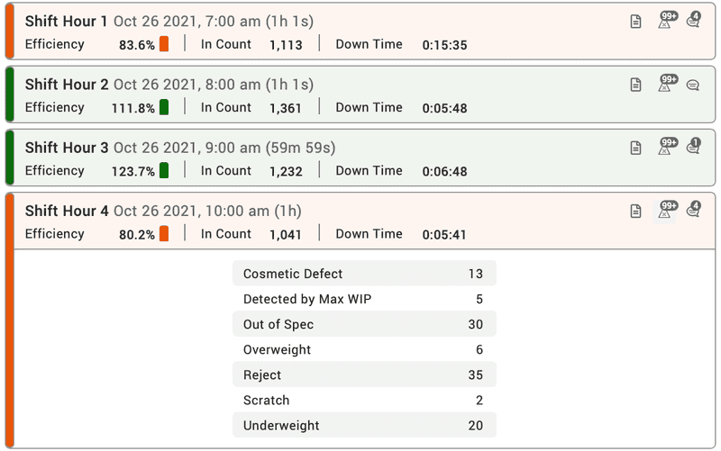
Then delve into the data. The three icons on the right of each event enable you to instantly explore:
- Metrics: View summary metrics and pinpoint the primary sources of lost production time with detailed Six Big Loss analytics
- Rejects: Explore the underlying reasons for poor quality
- Comments: Get additional context from comments directly linked to the event or associated with the event time frame
Top Losses Attention List
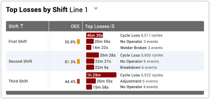
Tackle improvement tasks. One loss at a time.Attention lists are a table feature that shows ordered sets of losses as miniature bar charts. Now top losses are available as an attention list. Show up to five top losses per row, where each top loss includes the duration, the type of loss, and occurrences (events, cycles, stops, or pieces).
Top Losses attention lists are great for improvement meetings, as they provide you with an information-rich view of the most impactful losses. Think of it as a menu of improvement options!
Two-Week Time Schedules
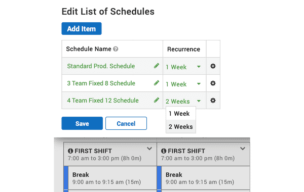
Schedules that easily align with your manufacturing operations.XL now supports two-week time schedules, with the ability to choose between 1 Week or 2 Weeks as recurrence patterns.
This enables you to create multi-week schedules such as a version of the “Pitman Shift Schedule,” where four teams split two half-day shifts in a two-week cycle, providing constant coverage on every manufacturing process.
We’ve also included a new option for an Empty Schedule that can be used to disable the time schedule feature.
Widget-Based Time Ranges
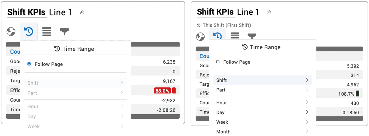
Compare multiple time ranges in one manufacturing productivity dashboard.Now, each dashboard widget can either follow the page time range selector or have its very own time range, which is shown immediately under the widget title. This is particularly useful for setting up columns in a dashboard with different time ranges such as: Last Shift vs This Shift or Yesterday vs Today.
Improved Dimension Picker
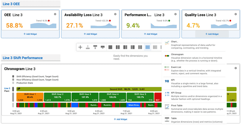
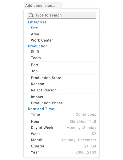
Easily find the dimensions you need.The reformatted dimension picker makes it easier to select the dimension you need.
Dimensions are now organized in three groups:
- Enterprise: Includes asset-based dimensions like Site and Work Center.
- Production: Includes dimensions related to the production process such as Shift, Part and Reject Reason.
- Date and Time: Includes dimensions related to time.
We also clarified the distinction between two fundamentally different “types” of time dimensions: continuous time and date parts.
The Time dimension represents continuous time, meaning it shows you time as flowing from the beginning to the end of the time range chosen in the time range selector.
Other Date and Time dimensions represent date parts. Date parts extract part of a date, allowing you to see aggregated time periods for easy comparison. For example, you can choose Day of Week and see aggregated data for all the Mondays, Tuesdays, etc. within the selected time range.
2.14
Rich Table Content
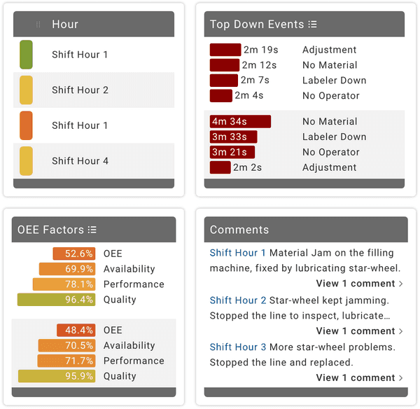
Compare. Contrast. Explore. Learn. Act.We’ve added four entirely new column types that work together to create visually impactful reports - perfect for meetings where you want to quickly compare and contrast with a high-density of production data.
Row Color uses heat map colors to add a visually impactful performance summary in every row.
Attention Lists visualize key losses: machine downtime events and reasons, changeover events and reasons, and reject reasons.
Metric Lists enable instant KPI comparisons. Choose from 24 carefully curated metric sets, such as Production Overview, Cycle Time Audit, OEE Factors, and Hidden Factory.
Comments integrate details about any event or time period with the ability to learn more with a single click.
Advanced Table Sorting
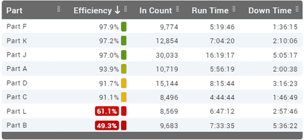
Sort. Limit. Personalize.Instantly access multicolumn sorting for tables. Click once for ascending, twice for descending, thrice to turn off. Shift-click for multicolumn sorts. Add in limits to create tables with production data like:
- 10 Part Runs with Lowest OEE
- Top 10 Down Reasons
- Top 3 Reject Reasons per Work Center
Improved TPT and Timeline Pages
Visualize your production data collection software.We have taken one of our most popular features and made it even better.
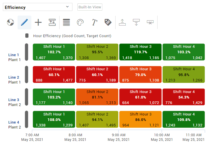
The TPT chronogram now has a shift hour strip, text overlays for dimension values, efficiency, good count, and target count, and heat map colors based on efficiency.
The TPT table now has live controls, with the ability to choose between event, aggregated, and hierarchical tables, and any table can now be instantly exported.
The Timeline page now has fully configurable chronograms with live controls, an all-new set of built-in views, text overlays for key metrics, and heat map colors.
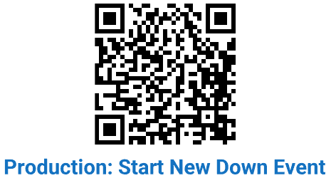
Start New Down Event
Improved operator control over machine downtime events. Simpler shop floor data collection.For most applications automated down detection is a wonderful thing. However, for processes with long cycle times, sometimes it is better for the operator to be able to scan a Start New Down Event barcode to change production state.
If scanned during Detecting State, the state is "detected" as Down and auto run/down detection is restarted. If scanned during Run, a new Down event is created starting at the scan time. This command is also available through the XL API.
2.13
Capture Comments
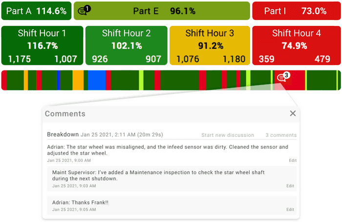
Add context to any production event.Instantly add comments to any production event, such as a down event, changeover, or part run. Simply click on any chronogram event to add a comment regarding your production data.
Our new comments feature works great in combination with another newer XL feature – heat map chronograms. Scan for “red” events and make sure each such significant event has a comment.
Use comments to add context to a reason, explain what went wrong, describe how you addressed a problem, or add to the conversation with a reply. Capture details that add value to review meetings or deep analytics for improvement programs.
Analyze Comments
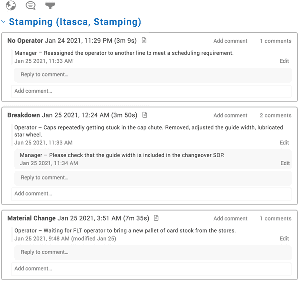
Mine for insights. Take action.Analyze comments to identify followup and improvement actions – or simply to verify that your team is following your policies for capturing comments.
The new View Comments page is perfect for exploring comments. Select a built-in view or search for one or more words, such as OEE or conveyer jam. Gain further insights and context with single-click access to a complete loss report for each and every event.
Or, create your own views. Focus on a specific type of event, such as down events or changeovers. Or look at all comments that occur during a period of time – such as a shift or part run. Add filters to refine your view. Create views that align to or verify company policy, such as:
- Part Runs with OEE Below 65%
- Down Events over 15 minutes with No Comments
Cloud-Based Management of Work Center Hierarchies
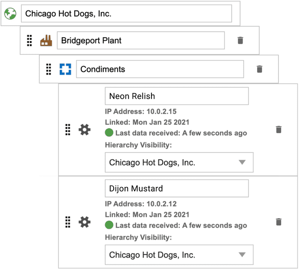
Single-point control from the cloud.Organize the hierarchy of all your work centers, and how they roll up, in one place – XL Enterprise.
- Devices linked to XL Enterprise are automatically added to the enterprise hierarchy.
- Set the portion of hierarchy that can be seen from the linked XL device.
- Set the portion of hierarchy that can be seen by each XL Enterprise user.
- See the link status of every XL device.
- Based on the ANSI/ISA-95 standard (Enterprise, Site, Area, Work Center).
Even better – it’s a free, cloud-based service provided by XL Enterprise.
More Powerful Tables
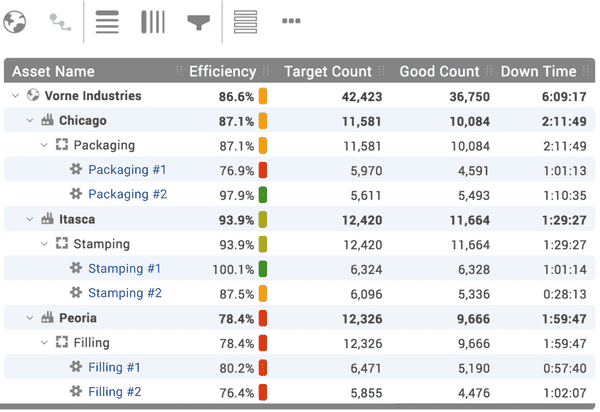
Live controls and so much more.We’ve completely redesigned our tables and packed them full of new features.
- Live controls are the fastest path between your imagination and what is on the page. With live controls, tables update in real time as you change their design.
- New grouping options make it easier than ever to create event-based, aggregated, and hierarchical tables.
- Heat map colors provide continuous range status indication for normalized metrics. Quickly scan for problems that leap from the page.
- Improved aesthetics provide a cleaner look for every table.
- Automatically set column widths can be easily adjusted and saved with views.
- Even more new features are coming to tables in our next release.
Advanced Filter Control
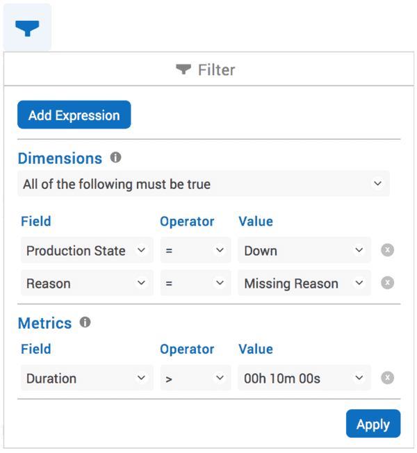
We’ve made it easy to create complex filters.Refine your analysis with our new advanced filter control. XL now supports filtering on both dimensions and metrics, including support for complex filters with multiple dimensions and metrics.
Examples of filters you can build include:
- Show all down events that are missing a reason and that lasted longer than 10 minutes.
- Show comments for all part runs where OEE was below 65%.
- Show only down events and changeovers.
Flexible Control Over Counts
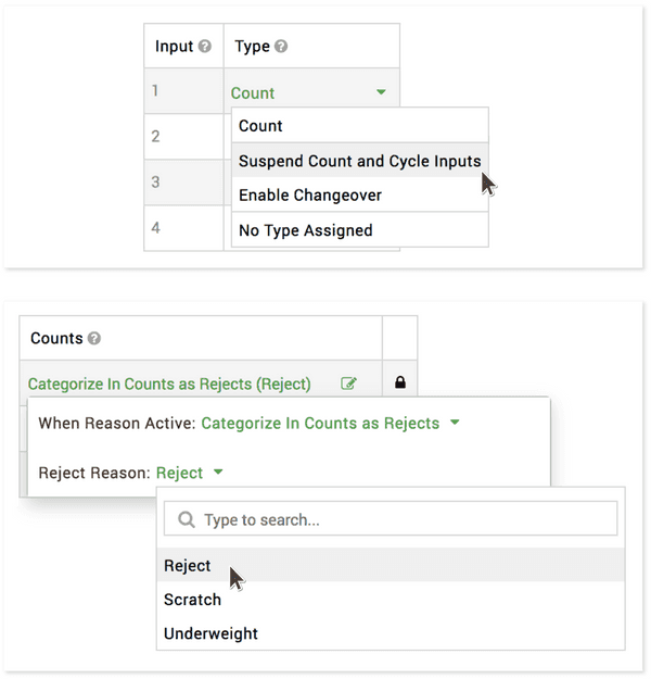
Suspend counts by input or reason.It can be very useful to ignore or recharacterize counts when production is in a certain state, such as running rework or in a changeover. You can now do just that by:
- Digital Input
- Reason
Configure any digital input to suspend all count and cycle inputs. This provides an automatable hardware-based mechanism for ignoring counts. For example, you may want to ignore all counts while running rework.
Configure any Planned Stop or Not Scheduled reason to ignore all counts or to categorize in counts as rejects. This provides an automatable state-based mechanism for ignoring or recharacterizing counts. For example, you may want to classify all counts as rejects while in a changeover.
Proxy Server Support
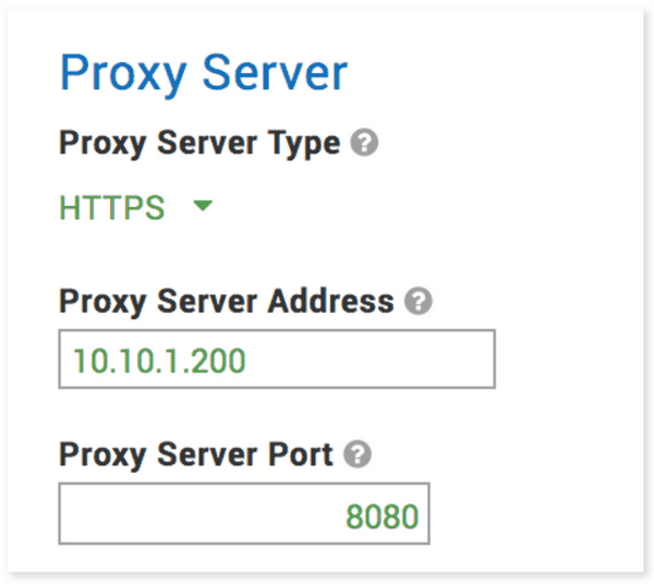
Access XL Enterprise through a proxy server.Now you can easily use your network proxy server as an intermediary between XL and XL Enterprise. For example, if your network firewall only supports static IP addresses, a proxy server can be used to provide DNS lookup and automatically manage connectivity to XL Enterprise.
Configure XL with a proxy server type, proxy server address, and proxy server port. Supported proxy server types include HTTPS, SOCKS (socks4, socks4a, socks5, socks5h) and HTTP with CONNECT tunneling.
2.12
Heat Map Charts
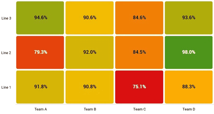
Production display software in technicolor.Using color to visualize production metrics is extremely effective for quickly spotting areas of concern – or areas where you are doing exceptionally well.
Normalized metrics (i.e., percentages) have heat map colors automatically generated from their metric alert ranges – spanning from red to amber to green. Other metrics are automatically generated in shades of red (e.g., Reject Count), green (e.g., Good Count), or blue (e.g., Total Count).
Choose from four different types of heat map charts: time (e.g., OEE over Time), dimension (e.g., OEE by Part), dimension over time (e.g., Utilization by Plant over Time), or dimension by dimension (e.g., Labor Efficiency by Asset by Team).
Powerful New Chronograms
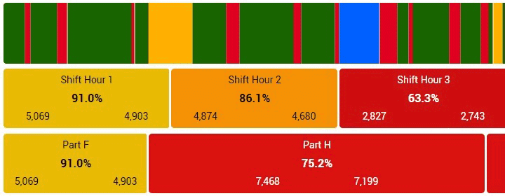
We’ve packed them full of useful new features.We have completely redesigned the chronogram – with a huge array of new features:
- Stack multiple chronogram strips with different data dimensions to clusters to visually discover patterns in your data.
- Use the new palette control to apply heat map colors.
- Use the new text overlay control to show dimension values and up to three metrics per event.
- Use the new label control to have XL generate legends for strips and labels for plant, area, and asset.
- Select the "Auto by Time Range" dimension to have XL automatically select dimensions based on the time range.
Introducing Live Controls
The fastest path to dashboard perfection.The KPI and Chronogram elements now feature “live” controls. Live controls provide the shortest distance between your imagination and your dashboards by showing instant changes to elements as you make selections in their controls. You will love how easy this makes chronogram configuration – especially with their many new features.

Manual Run Detection
Handy for applications with long cycle times.One of the most popular features in XL is automatic run detection, which continuously monitors the cycle input to detect if the process is running or down. For processes with long cycle times, it can often be better to control run detection from an external source. Now XL provides three ways to externally control the run detector:
- Digital input (typically from a PLC)
- Barcode scan (typically by an operator)
- XL API (typically through integration with other applications and systems)

Detecting State After No Production
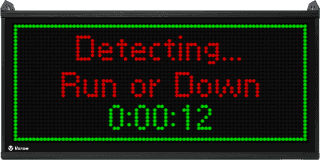
A subtle but useful improvement for operators.When a break or changeover ends, there is often a short period of time before running production can be detected. XL now assigns a temporary production state to this time and displays “Detecting… Run or Down” on the scoreboard to let the operator know that XL is automatically detecting the state. As soon as XL detects that the process is running or down, the scoreboard updates with the new production state and XL automatically adjusts the underlying event.
Improvements for Changeovers
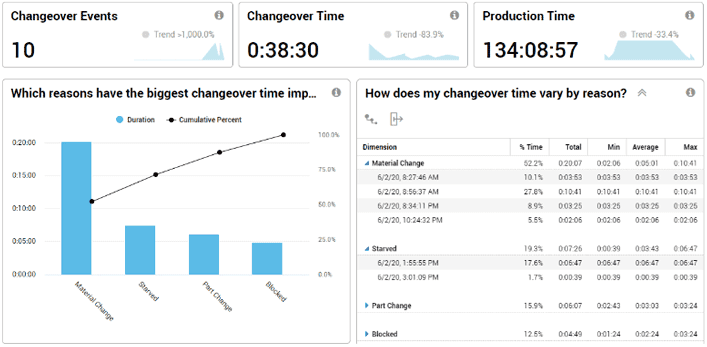
New reports. New options.Delve deeper into changeovers with reason analytics. We’ve updated the Changeover deep dive page to include:
- Pareto chart of changeover reasons.
- Hierarchical table of changeover reasons with drilldown into individual events.
XL also now includes an option to start changeovers via digital inputs to ease integration with other systems.
Improvements for Reject Reasons
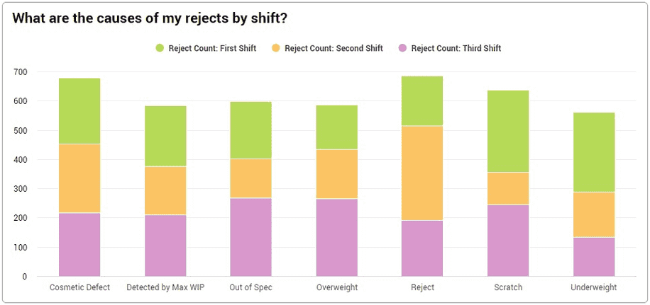
New reports. New dashboard functionality.We’ve made reject reasons a full-fledged analytics dimension. This means they are available throughout the reporting interface, including custom dashboard tables and charts.
We’ve also added new out-of-the-box charts to the Quality Loss deep dive page, including the ability to analyze rejects by production phase, production state, and shift.
More Scoreboard Languages
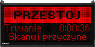
Your scoreboard. Your language. Your digital signage solution.XL now displays commonly shown scoreboard messages in your choice of English, Dutch, French, German, Italian, Polish, Portuguese, or Spanish. The language is selected based on the device locale setting.
And of course, as before, all of these languages are available in the XL web-based interface (as a “preview” feature).
Additional Features
As always…lots of “smaller” improvements as well.
- Discontinuous Events: If a changeover, down, or maintenance event (i.e., production) is split by a meal/break or meeting (i.e., no production) the two parts are now automatically treated as a single event.
- Reject Reason API Support: You can now submit reject reasons with count quantities through the XL API to enable easy integration with other systems and applications.
- Part Barcode Duplicate Scans: Scanning the barcode for a running part will now start a new part run for the same part. This enables running the same part twice in a row. It also enables changing part settings and having the new settings immediately take effect.
- Scoreboard Format Options: You can now set the number of decimal places for cycle times (as well as percentages) displayed on the scoreboard, which is particularly useful for long cycle time applications.
- Display Time of Day: There is now an option to display time of day on the scoreboard.
2.11
Automated Shift Reports
Emailed directly to your team.
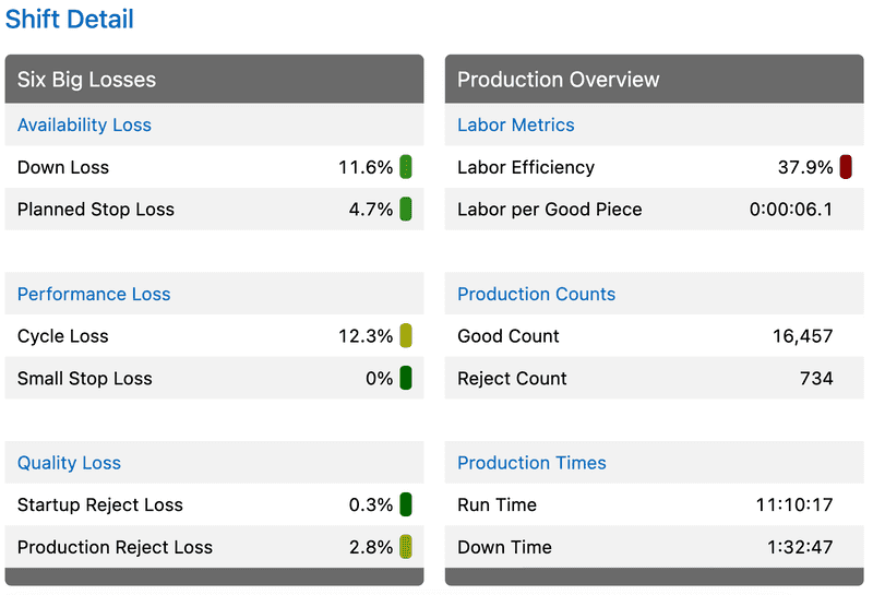
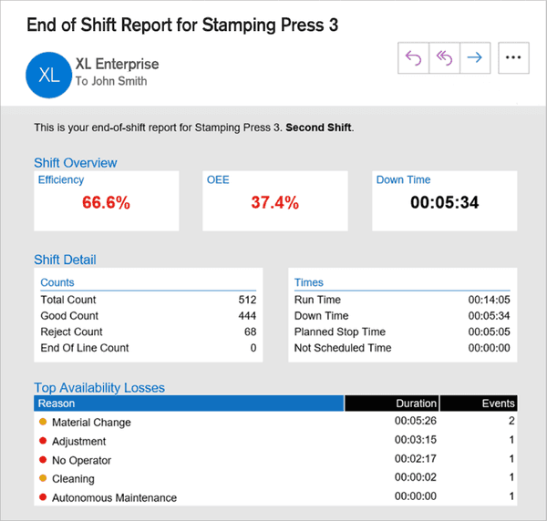
Your team can now receive an instant end-of-shift summary report from XL Enterprise with key metrics, comprehensive loss information, and a summary of all part runs for that shift. The report includes:
- Shift Overview with large format KPIs.
- Shift Detail with 24 key metrics grouped into: Counts, Times, OEE, Labor, Cycle Analytics, and Quality Analytics.
- Availability Analytics with the top 10 reasons (typically down events and changeovers).
- Part Runs with an overview of every part that was run during the shift.
It is easy for team members to subscribe and for your entire team to work from the same set of timely and accurate information.
Enterprise-Aware Dashboards
KPI and KPI Group join the club.
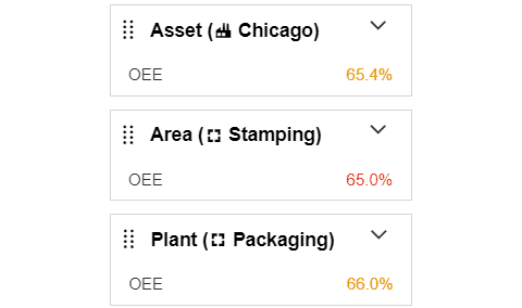
With the addition of the KPI and KPI Group, all five production dashboard elements are now enterprise-aware, which means they can show rolled-up data for any level of your enterprise hierarchy. For example, you can use a KPI element to show the OEE for a single asset, for an entire area, or for your entire plant.
Multiple Dimension Charts
Create even more insightful charts.
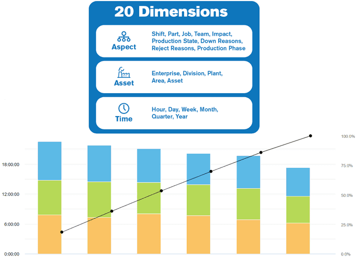
Dimensions are descriptive values that refer to a qualitative attribute of production, such as the Shift, Asset, or Hour. XL includes twenty different analytical dimensions and now you can create charts that incorporate multiple dimensions. Some examples of new charts you can create include:
- Machine Downtime by Reason by Shift
- OEE by Team by Hour
- Reject Count by Asset by Part
Text Message Alerts
Send real-time production data alerts to phones.
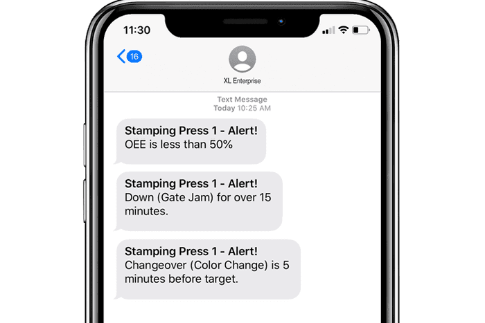
If your mobile carrier supports email to text message gateways, you can now choose to receive alerts (real-time notifications based on metrics, production state and targets) as text messages instead of emails.
Please note that not all carriers provide this service and some carriers only provide it as a premium service (e.g., Verizon). Also, message and data rates from your mobile carrier may apply to text messages sent by the cloud-based XL Enterprise.
More Ways to Scan Parts and Jobs
Scan your existing work orders and manufacturing products.
We’ve added several features that simplify using your existing barcodes from work orders and products to start part runs or jobs. These features are part of our Micro-MES™ suite, which enables you to start a part run or job with a mouse click, by scanning a barcode, or via the XL API.
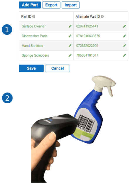
The first feature is the Alternate Part ID. Now you can use the Part ID for reporting and the Alternate Part ID for integrating to existing barcodes and software systems such as an inventory management system.
The second feature is unrecognized barcodes. The unrecognized barcode feature is typically used to scan barcodes you already have on work orders or manufacturing products. XL 2.11 includes two new options for how to interpret unrecognized barcodes. The complete set of options is:
- Ignore
- Match to Part ID and Start Part Run
- Match to Job ID and Start Job (new)
- Tag as Job ID for Current Part Run (new)
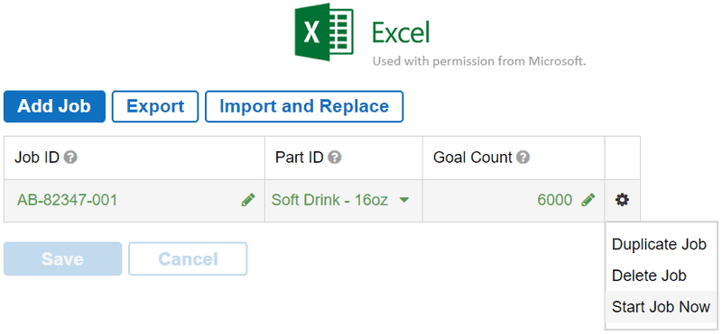
Import Jobs from Excel
Export. Modify. Import. Done.
You can now export jobs from XL as a Microsoft Excel spreadsheet, make any desired updates, and then import the updated jobs back into XL. It is easier than ever to quickly and efficiently configure jobs using a tool you already know.
XL also supports direct integration with other systems and applications using the XL API. You can use this API to push information to XL (e.g., work orders and job parameters) or to retrieve information from XL (e.g., job metrics).
All-New Meet XL Guide
We’ve packed it full of valuable insights.
Our Meet XL guide has been completely rewritten to make it easier than ever to use XL to drive improvement at your manufacturing company. Not only does it describe the many advanced capabilities of XL, it also shares installation best practices and the most effective quick wins for driving improvement in the manufacturing industry.
If you’re managing XL in your company, or you simply want to understand more about XL, then this guide is for you.
Additional Features
We’ve also made lots of “smaller” improvements.
- Scoreboard: The scoreboard now shows the reason when the manufacturing process is not running.
- Late Start: If production is not running at the scheduled shift start time you can choose to carry over the active production state OR start the shift in a production state of your choosing.
- Relay Output: When production goes down you can choose for the scan reason relay to turn on immediately OR you can wait until the process is again running.
- Tooltips: We’ve added new metrics to several tooltips (TPT and Teams and Labor pages).
- XL API: The XL API now supports triggering inputs and the new Alternate Part ID, and we’ve also published more detailed API documentation.
2.10
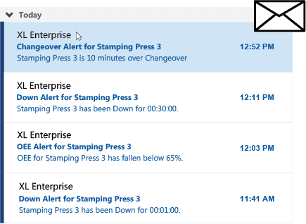
Automated Email Alerts
Reduce reaction times. Escalate issues.
Automatically send email alerts to key employees based on how your process is running. Alerts are delivered by XL Enterprise, which makes it easy to create automatically escalating alerts based on:
- Shift Metrics (e.g., OEE less than 75%).
- Production State (e.g., Down more than 10 minutes).
- Target Times (e.g., Changeover over target by 5 minutes).
XL Enterprise is a cloud-based SaaS application developed by Vorne as an integrated part of the XL platform.
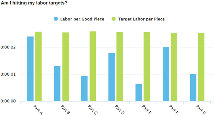
Labor Efficiency Tracking
Analyze and deliver on labor targets. Simplify shop floor data collection.
XL now calculates earned labor time and labor efficiency based on target labor times you define for each part. Instantly know if you are meeting or beating your labor standards.
We’ve also updated the Teams and Labor page to make it immediately apparent when you are NOT meeting your labor targets for one or more parts. We also show you labor efficiency over time, and provide tools for comparing the effectiveness of your teams. Or – create your very own dashboard reports.
Faster Reject Entry
Scan multiple rejects during a part run.
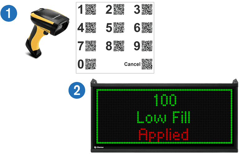
Many companies train their operators to scan rejects into XL in order to include operator-provided reasons for each reject.
Now XL makes this even easier with a new feature that enables operators to scan multiple rejects. Simply scan the number of rejects followed by the reject reason to include them in the current shift and part run.
Improved Run Detection
Choose between cycle- or speed-based.
XL now performs run and down detection based on the cycle input. This has a number of advantages – especially for applications where cycle speeds vary greatly by part.
Speed-based detection enables you to define running as a percentage of top speed sustained across a configurable number of cycles. Since XL calculates top speed from Ideal Cycle Time, run detection automatically and seamlessly adapts to each part you run.

Split Down Events
Accurately model what happens in real-time.
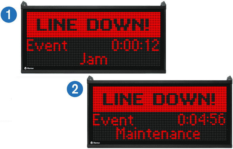
Scan the new Split Down Event barcode to separate one stop into a sequence of down events, each with its own reason.
For example, capture that the process went down because of a Jam. Then scan Split Down Event when the Jam is fixed and Maintenance is called to fix another problem discovered by your operators. Accurately model what happens in real-time when you have complex stops with lots of down time.
End Events by Target or Running
Automate to improve precision.
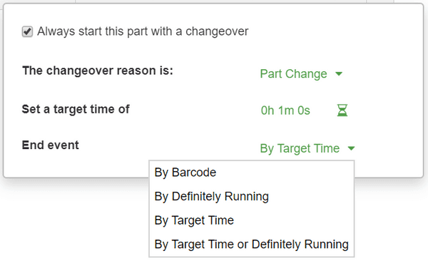
Sometimes you want an event, such as a meeting, to end after a certain amount of time, but if it ends early you want to automatically detect when production starts. For example, you may want down time recorded if a changeover exceeds target time and run time recorded if a changeover beats target time.
XL now directly supports this with a new option for ending events, “By Target Time or Definitely Running”. Your event will automatically end by whichever occurs first.
Improved Bench Test
Simulate production at your desk with XL.
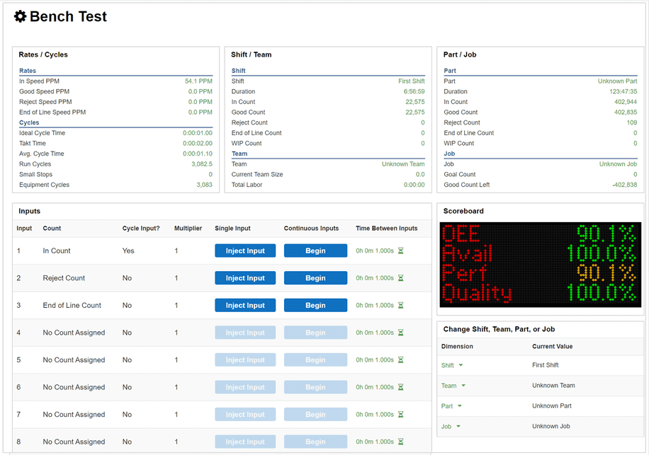
Learn how XL works and tune it for your production process from the comfort of your office – even before you install XL.
With the updated bench test page you can now trigger inputs, jobs, parts, shifts, teams, and reasons with full visibility on how this affects your KPIs and the scoreboard.
Hide Time with No Production
Cleaner reporting. Simpler information.
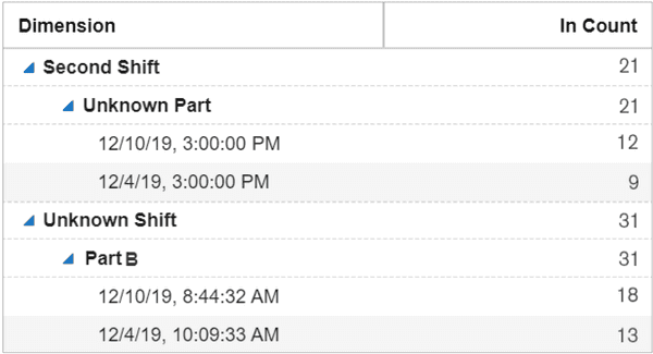
XL is always monitoring your process – even when the process is not scheduled to run. XL now automatically removes periods of time with no production data from your reports.
On the other hand, if XL detects counts when production is not scheduled it categorizes this as “Unknown” (e.g., Unknown Shift, Unknown Part) and shows it in reports.
Additional Features
Yep. More good stuff :)
- Part Scan Starts Production: You no longer need to scan “Start Production” after starting a new Part.
- Improved Page Printing: We optimized the KPI element for printing. Top 5 Losses now prints on one page.
- Updated Scan Reason Behavior: The “Scan Reason” reminder is now removed upon the first non-running event (e.g., Break) to prevent operator confusion.
- Time Schedule Late Start: We reworked the Time Schedule > Late Start option configuration and operation to make it significantly simpler and more understandable.
2.9
Teams and Labor
Track and analyze labor metrics.
Includes tools for analyzing any of the 100+ XL metrics by the new team dimension as well as adding a brand-new set of metrics for labor analytics. We’ve also added a new Teams and Labor ‘deep dive’ page for instant out-of-the box analytics. Of course, you can also incorporate the new team dimension and labor metrics in your own dashboards.

Simplified Cycle Metrics
Now aligned to the Six Big Losses.
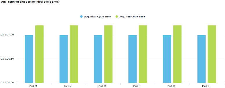
We’ve simplified and improved XL cycle metrics to make it easier to assess the impact of cycle times on productivity. This includes aligning cycle metrics with the Six Big Losses, with a focus on Run Cycles and Small Stops. We’ve also added a new Equipment Cycles metric to support cycle-based asset care programs. And we’ve updated the Speed Loss page (now called Performance Loss) with new features, like the ability to validate ideal cycle times for each part.
Improved Top Losses
Refreshed interface, new functionality.
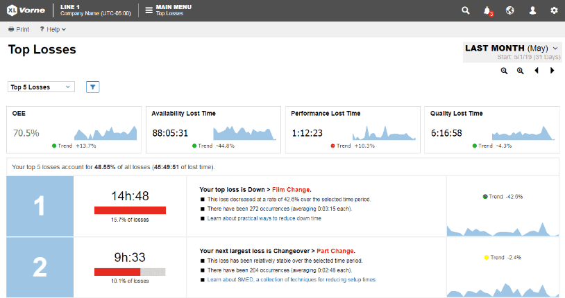
Top Losses is one of the most popular and powerful features in XL. In fact, many companies use it as their “continuous improvement roadmap”. Now it includes a KPI bar with OEE and underlying losses of Availability, Performance, and Quality. The KPI bar includes metrics, trend information and sparklines to provide context to your top losses.
Filtered Analyze Pages
Powerful filtering for deep dives.
Our eight dedicated analytics pages provide deep dives into OEE, Six Big Losses, TEEP, Down Time, Changeover, Performance Loss, Quality Loss, as well as Teams and Labor. Now you can filter information on any of these pages by Shift, Part, Team, Production Phase, and Shift Hour. Dive deep by homing in on exactly what you want to see and explore.

Mobile-Friendly Navigation
Optimized navigation for phones and tablets.
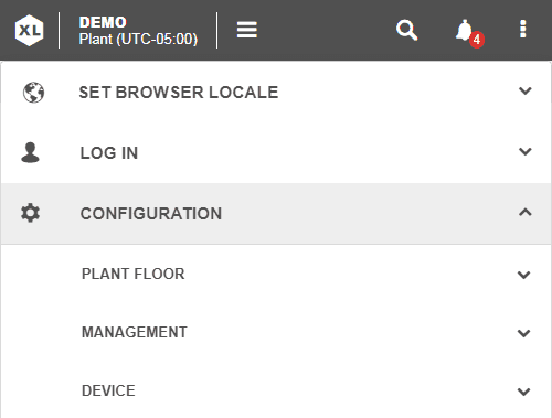
We’ve redesigned our navigation bar, control bar, and menus to work seamlessly with full functionality across all device screens from large to small. And, we’ve taken special care to ensure that the most-used features are always fast and easy to access.
2.8
Andon Page
An information-rich picture of manufacturing.
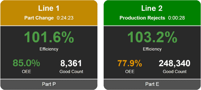
See a real-time, highly visual picture of the current state of manufacturing. Instantly know where to focus your attention. Green means running. Red means down. Amber means changeover. Blue means not scheduled. View any portion of your asset hierarchy – enterprise, division, plant, or area. Select your favorite KPIs. XL automatically applies metric alerts to highlight areas of concern: amber (may need attention), red (needs immediate attention) or blocked red (deserves strong and immediate attention). Most importantly – take action!
Stacked Chronograms
Compare assets across a synchronized timeline.
The chronogram is a great tool for visually exploring production over time. Now you can stack and compare multiple assets across a synchronized timeline. View an area, plant, division or your entire enterprise. Select any dimension, such as production state, hour, impact, or any of the dozen different perspectives. Stack chronograms on custom dashboards or simply navigate to the all-new Timeline page to see stackable chronograms in action.

Native Excel Export
Any table. Any metrics. Any dimensions.
Now you can easily export data directly to an Excel file. Export tabular data from any page or view, or create your own export formats using dashboard tables with any combination of metrics and dimensions. With XL you always have direct access to all of your data.
Micro-MES™
Configure and start jobs from XL.
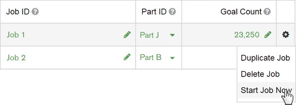
We’ve expanded a popular XL feature called Micro-MES. You can already scan job barcodes and integrate your on premise or cloud ERP system or manufacturing ERP software with XL using a simple REST API to load job parameters, run the job, and then retrieve the results. Now we’ve added the ability to configure jobs directly in XL and start them with a click of a mouse. Start jobs with barcodes, by clicking a mouse, or via the XL API. Track, integrate, analyze. Simplify your overall ERP solution.
Import and Export Parts
Easily manage part configuration.
We’ve simplified and streamlined configuring parts. Import or export all part settings, such as Ideal Cycle Time, Takt Time, Down threshold, and Start with Changeover for up to 1,000 parts. Easily add new parts and update existing parts. Accelerate deployments. Standardize settings. Upload the same part data to multiple XL devices.

2.7
Help Videos
Guided learning for XL.
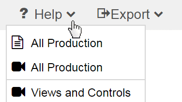
Short and focused videos make it super-fast and super-easy to learn XL. Videos are available through on-page help menus or through the all-in-one help videos page. Learn how to use each feature of XL – and even more importantly how to use each feature to drive improvements in productivity. Each video is carefully crafted to make you an expert in that area of XL in just a few minutes.
Loss Report Tooltips
Rich analytics for chronograms.
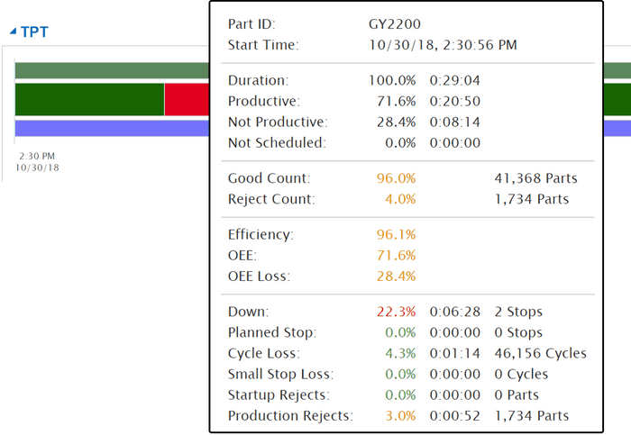
The chronogram and total production timeline are outstanding tools for visually exploring production. And now they are even more powerful. Get a complete loss report for any interval of time in your chronogram. The report includes a time analysis, count summary, OEE metrics, and Six Big Loss details. See complete loss analytics for each and every event, all the way down to individual run events.
Enhanced Time Range Selector
Travel from real-time to historical.
The all-new time range selector is packed with features. Seamlessly travel from real-time to historical with a single click. For example, start at This Shift, click back to Last Shift, and then to 2 Shifts Ago. View sensibly aligned information for multiple assets, even across time zones. Zoom in for more detail, such as exploring shifts and part runs hour-by-hour. Easily reference where you are in time – both start and span. All consistently and quickly across every page.

Update Captured Reasons
Build a precision information foundation.
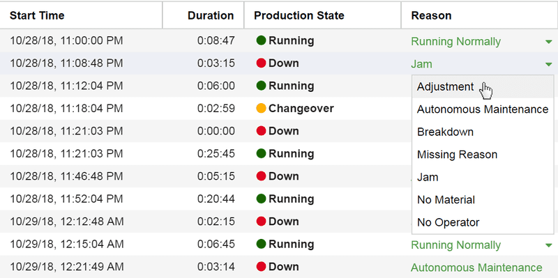
Have your operators ever scanned the wrong reason? Forgot to scan a reason? Now its easier than ever to maintain the accuracy of your information foundation. Fill in missing reasons. Update incorrect reasons. Be confident that your decisions are based on accurate data. Login and navigate to Settings > Management > Modify Data > Change Reasons to access this new feature.
2.6
XL Enterprise
Cloud-delivered software updates.
XL Enterprise is our cloud-based platform, and in this first release it delivers free software updates to your XL devices. You maintain full control. Decide if you want XL to check for updates automatically. XL loads updates in the background and you simply click to install. It’s that easy!
Shift Hours
Hour-based reporting aligned to shifts.
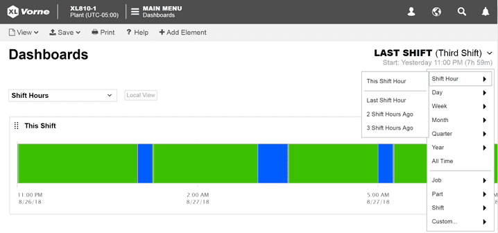
Hour-by-hour boards are particularly popular in automotive and in lean manufacturing. We’ve brought the concept to XL by aligning hour-based reporting to your shift schedules. Compare hours across shifts regardless of time zones or when shifts started.
2.5
XL Plant
Design dashboards to show your entire plant.
XL Plant enables any XL device to rollup data from all other network-connected XLs. Design dashboards with charts and tables that capture whatever information is most important to you – across your entire plant.
Clear Selected History
Keep your data pristine.
Ever have a misaligned sensor? Just starting to use XL to collect information? One piece of incorrect information can erode trust in your data – so keep it pristine. If despite your best efforts, accurate data collection is compromised for a short period of time – clear out just the inaccurate information and make decisions based purely on pristine data.

Improved Part Configuration
Automatic changeovers made even simpler.
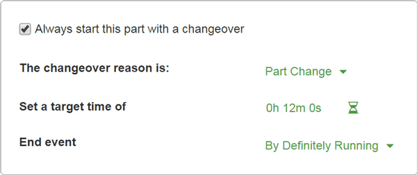
One screen for tracking changeovers. Associate a specific changeover reason with each part, a target time, and how the changeover should end.
Use Your Own Part Barcodes
Scan existing barcodes to start production.
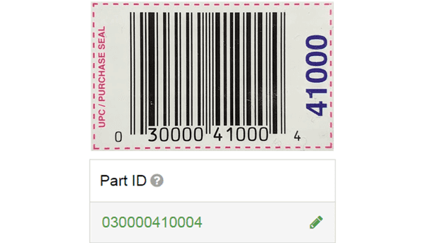
XL makes it easy to use your existing part barcodes to start part runs. In XL, enter your Part ID and part-related settings. At the machine, when the operator scans your existing part barcode XL will match it up and start the part run.
Easy Network Configuration
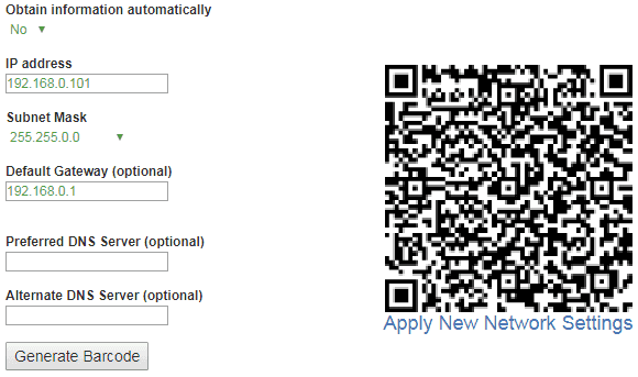
Network Configuration. Simple. Easy.
Not using DHCP? Visit www.vorne.com/set-ip. Generate barcode. Scan barcode. Done. XL is on the network.
Automatic Conversion of Down Events
More accurate changeover times.
When XL detects a short down event immediately before a changeover it now runs a quick analysis based counts, cycles, and down reasons, and where appropriate converts the down event to be part of the changeover.

2.4
Locale Selection
Your data. Your country. Your language.
A preview release for internationalization and localization of the browser-based interface. Includes 9 languages (English, Spanish, German, French, Italian, Dutch, Polish, Chinese, and Japanese) and data formatting for 28 locales. Professional translations will be rolled out with future releases.
Job API
Integrate your on premise or cloud ERP system to XL.
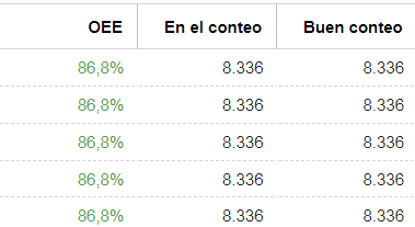
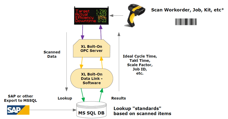
XL now includes an Application Programming Interface (API) for programmatically starting the next job. Also includes metrics for Goal Count, Good Pieces Left, and Percent Done, as well as a barcode register for reading job- or part-related barcodes scanned by the operator. This is a perfect fit for integration with your manufacturing ERP software.
Improved Reason UI
It’s even easier to configure reasons.
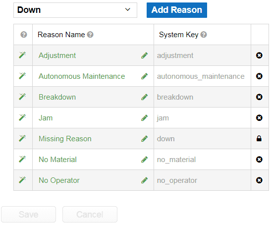
Based on field feedback, we’ve simplified and streamlined the interface for configuring reasons. In addition, each process state (e.g., Down) now has its own reason configuration page making it easier to focus on what matters most for that set of reasons.
Data Management Fields
A robust data management framework.
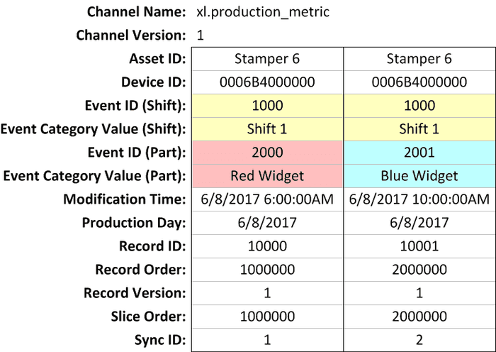
We’ve implemented a new framework of system fields that make it much easier to robustly manage data on an enterprise scale. This includes replicating XL data for backup databases and syncing XL data for reporting databases.
Core Concepts
Making powerful easy.
The most important feature of XL is “easy” (we call it XL Easy). We’ve distilled key functionality of XL into simple one-page descriptions called Core Concepts. Each Core Concept presents a set of related concepts that are core to how XL works. With Core Concepts you spend less time learning and more time using.
2.3
All Production
See all your manufacturing processes in real-time.
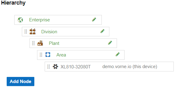
All Production rolls up metrics across your enterprise – real-time and historical. Drag-and-drop divisions, plants, areas, and manufacturing processes to build an enterprise hierarchy that matches your company. Personalize pages with time range, root, hierarchy, level, and value controls, and save pages with your preferred views. Monitor 100+ manufacturing processes (Chrome recommended for best performance).
Save and Share Pages
Personalize pages with your preferred views.
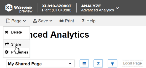
Create, save, and share Dashboard, Advanced Analytics, All Production, and Historical All Production pages with all of their settings so you can instantly come back to your preferred views. Settings include controls (e.g., time range, dimension, value, and filter controls) or in the case of dashboards configured widgets. Pages can be local (just for you) or shared (available to everyone).
Automatically Detect Startup Rejects
A simple way to analyze startup rejects.
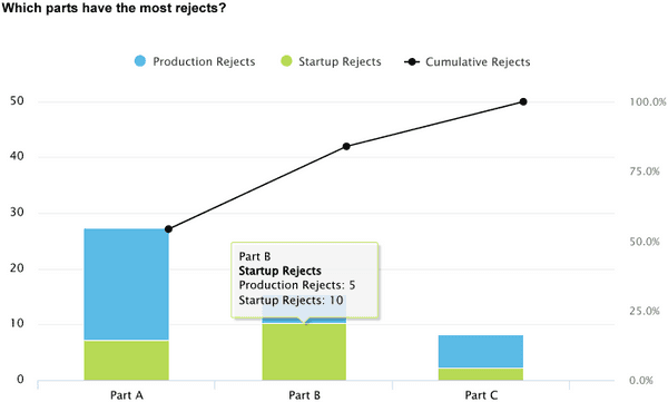
XL automatically categorizes rejects that occur during changeovers and initial production as startup rejects (as differentiated from production rejects). You can configure the amount of time that is considered “startup” to best match your manufacturing process. This feature further tunes Six Big Losses and makes it easy to gather useful information without operator intervention.
Faster Reason Configuration
Filter by process state for faster configuration.
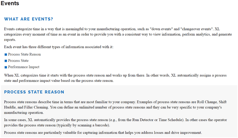
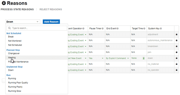
Reasons enable operators to provide important information about the state of your manufacturing process with a simple barcode scan. Now it’s faster and easier to configure reasons with the ability to filter reasons by process state – so you can focus on one type of reason at a time.
2.2
Metric Alerts
Instant alerts when attention is needed.
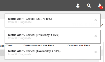
XL now alerts you when key metrics are out of their desired range. You can configure over 20 metrics (e.g., OEE, Efficiency, Down Loss, Cycle Loss, and Quality Loss), each with four ranges: Normal, Caution, Warning, and Critical. Metrics automatically change color on the scoreboard and web interface based on alert status, and alert notifications are additionally delivered through the web interface.
Reject Reasons
Comprehensive quality analytics.
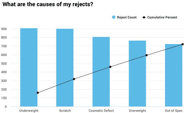
XL now provides comprehensive quality analytics, with a reject reason logged with every rejected part. Reject reasons can be logged through digital inputs or barcode scans. An unlimited number of reject reasons can be configured and the resulting data can be charted, trended, and more.
Run Screen Configuration
Quickly select scoreboard KPIs.
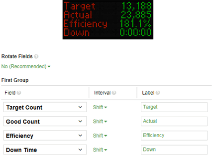
Now you can configure your own run screen – in just seconds. An instant preview shows you exactly what the run screen will look like, including easy-to-change text labels. Each metric can be displayed in real-time for the current shift, part run, or hour.
Hidden Factory Metric
An instant view of your hidden factory.
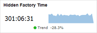
XL now includes a Hidden Factory Time metric, which measures the gap between fully productive time and all time. This gap includes all losses (including capacity losses), and represents how much production time would be reclaimed if you were running around the clock, making only good parts, as fast as possible, with no down time.
Configuration Backup
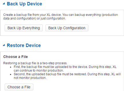
Fast backups of device configuration.
Previously, device backups always included production data and configuration data. Now you have an option to only backup configuration, which is faster and creates a smaller backup file. A common application is cloning configuration of XL units for other installations.
2.1
Data Quality Alerts
Build a better information foundation.
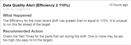
The first responsibility of XL is to provide you with a highly accurate information foundation. After all, accurate data drives better decisions, actions, and results. Now, XL automatically monitors key metrics for data quality and alerts you with recommended actions whenever it encounters suspect values.
New Improvement Techniques
Best practices distilled to their essence.
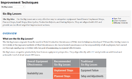
Our growing library of improvement techniques provides you with best practices for improving manufacturing productivity. Topics draw from two worlds: manufacturing (such as lean, theory of constraints, six sigma) and personal development (such as coaching, leadership, and self-development). New topics include Six Big Losses, Great Meetings, and Be Your Best.
TPT Improvements
Drill down from big picture to rich details.
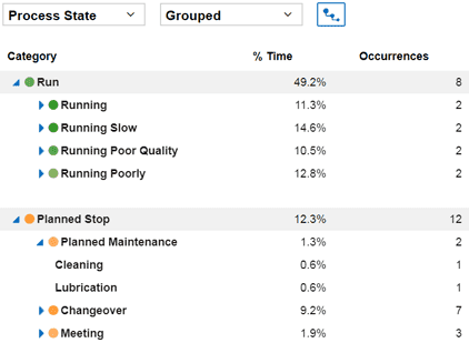
Seamlessly drill down from a top-level view of manufacturing as captured by Performance Impact, to additional details about your Process State, to a rich tapestry of detail provided by Process State Reasons. Whenever you see an area of interest, drill down until you reach the desired level of detail.
2.0
All New User Interface
Reimagined for super-fast and easy.
We’ve entirely redesigned the XL user interface to make it even more intuitive and easy to use. A larger content area, an all-new command bar, simplified configuration, a universal time range selector with time travel and zoom, and powerful controls for exploring data with dimensions, values, and filters. And that is just the beginning of what’s new.
Deep Dive Reports
Immediate answers to critical questions.
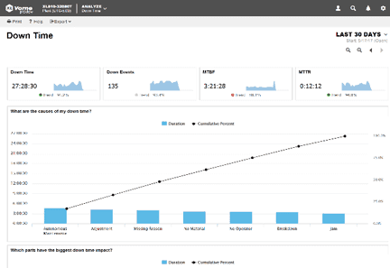
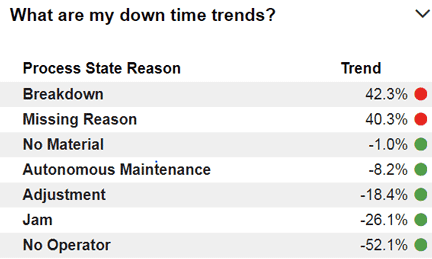
XL now includes prebuilt reports that answer critical questions, such as “Which parts have the biggest loss impact?”, “What are my down time trends?”, or “How does my changeover time vary by part?” Deep dive into OEE, Six Big Losses, Down Time, Changeover, Speed Loss, and Rejects.
Dashboards
Information exactly how you want it.
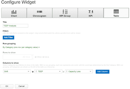
Organize information in whatever way works best for you. Create an unlimited number of dashboards from Chart, Chronogram, KPI, KPI Group and Table widgets. Create local dashboards for personal use or share dashboards with your entire team.
Six Big Losses
A unique twist on a classic concept.
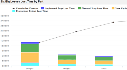
We’ve reimagined the Six Big Losses, making them easy-to-understand and comprehensive in capturing your losses. Every loss is automatically categorized as an Unplanned Stop, a Planned Stop, a Small Stop, a Slow Cycle, a Startup Reject, or a Production Reject. Losses are available as percentages or time, and can be viewed from different perspectives, such as Shift, Job, Part, Hour or Process State.
TEEP
Extend OEE by adding Utilization.
TEEP (Total Effective Equipment Performance) provides insights as to the true capacity of your manufacturing operation. It takes into account both Equipment Losses (as measured by OEE) and Schedule Losses (as measured by Utilization). It measures the percentage of all time that is truly productive. XL now measures TEEP, Utilization, Capacity Loss, and Capacity Lost Time.


