Machine Downtime Tracking and Reporting
Downtime tracking is one of the most direct ways to improve manufacturing productivity. For most processes, downtime is the largest source of lost production time. It is also one of the easiest losses to measure - and improve - when it is tracked accurately.
That said, simply collecting downtime data is not enough. To be useful, that data needs to be visible, understandable, and tied to action.
Vorne XL is designed to do exactly that. It connects directly to your machines and converts real-time signals into accurate production metrics, including downtime, uptime, OEE, and more. By automating data collection and presenting it in real time, XL makes it possible to move beyond tracking downtime to actually reducing it.
How Downtime Tracking Works with XL
With Vorne XL, downtime tracking is handled directly at the machine, so events are captured as they happen instead of being written down later.
- Downtime is detected directly from the machine: When a line stops, XL detects the event immediately from sensor signals and begins tracking its duration. This removes a lot of the gaps resulting from manual tracking, especially for shorter stops that are easy to miss.
- Each event is measured accurately: As the process runs, downtime events are captured automatically and measured consistently. This gives you a much more reliable baseline, which is important when you start making improvements and want to assess whether they are actually working.
- Operators assign reasons at the right time: Operators can then assign downtime reasons once the line is running again. This can be done using the integrated touchscreen (XL Touch), a barcode scanner, or another interface. In practice, this tends to result in more accurate reason tracking since operators are not trying to record information while also dealing with the stop itself.
- Information is visible immediately: The information is available right away. Downtime is displayed in real time on plant floor scoreboards and in dashboards, so operators and supervisors can see what is happening during the shift - not just after it ends.
- Reports are generated automatically: From there, the same data feeds directly into reports. XL generates views such as Pareto charts, timelines, and Top Losses automatically, which makes it easier to see where downtime is coming from and decide where to focus next.
Since downtime is captured directly from the machine and handled consistently, the data is typically more reliable than what comes from manual logs.
What Is Downtime Tracking?
Downtime tracking is the collection of and reporting on machine data related to unplanned stops on your production line. It is a foundational step for reducing downtime; you can only monitor the success of your improvement actions once you have an accurate baseline for comparison.
We’ve included imagery and explanations for many examples of downtime reporting throughout this article. This is because while machine downtime tracking starts with gathering data, it extends beyond that to include presenting that data in an easily comprehensible way.
It is essential to track machine downtime using an automated system in order to eliminate human error and allow for actionable analysis through focused reports. Fortunately, downtime tracking is very easy to automate. All you need is a sensor capable of monitoring cycles at the constraint of your process. It is important that you measure downtime at the constraint. This is because the constraint is the point of leverage for the entire process, meaning only by improving the constraint will you improve the process as a whole.
Types of Downtime
There are two types of manufacturing time that are often referred to as downtime: unplanned downtime and planned downtime.
- What do these have in common? They are both OEE Availability losses, which essentially means you want to get back to running as soon as possible.
- What is fundamentally different about the two? Unplanned downtime is not scheduled. Planned downtime is scheduled.
We can and should distinguish between unplanned and planned downtime because they each have different root causes and they each require different actions by your team to mitigate them. This is why they are also differentiated in the Six Big Losses.
Unplanned Downtime
Unplanned downtime is any time when your line stops unexpectedly for an appreciable length of time (longer than a “small stop”, as discussed later). A few examples of unplanned downtime include line stoppages due to a conveyer jam, equipment failure, overheating, electrical issues, material problems, or any other unforeseen issue.
Each stop should be assigned a corresponding downtime reason by your operators so that it is easy to keep track of which problems are causing the most downtime.
Planned Downtime
Planned downtime, on the other hand, is an intentional (i.e., scheduled) pause during planned production time. Time outside of planned production time, such as a break where the process is not intended to be running, is not included in planned downtime.
A few examples of planned downtime include changeovers, setup, planned maintenance, or any other planned stoppage during scheduled production time. Some amount of planned downtime is usually necessary. You may not be able to eliminate the need for some such events, but you can almost certainly reduce the amount of time they take.
When a planned stop runs longer than the target or scheduled time, you may want to transition into unplanned downtime to call attention to the overage time.
Collecting Downtime Data
While manual tracking can work reasonably well for some manufacturing KPIs (e.g., reject counts), when it comes to tracking downtime, we strongly recommend automated data collection. This recommendation is based on real-world experience in working with many hundreds of companies across dozens of industries. Manually recorded downtime is often highly inaccurate, and companies that switch to automated tracking are often shocked to discover their true downtime.
Manual tracking is often done with tracking sheets, which have many sources of inaccuracy, such as overlooking shorter down time events and underestimating the duration of longer downtime events. It is nearly impossible to remove subtle forms of human bias from manual tracking.
Automatic data collection comes with the added benefit of making it easy for operators to record downtime reasons (via HMI or barcode scanner). Reasons can be automatically tagged to detected downtime events by your downtime tracking software. This enables operators to defer scanning a reason for the downtime event until the process is running again.
When you define a set of downtime reasons, keep in mind what you are going to do with the downtime data you collect. The purpose of collecting the information is to identify and mitigate the sources of your downtime. That is why we also strongly recommend that you optimize your downtime reason codes to the smallest set of reasons that are truly actionable (no more than 25 reasons). Your operators are much more likely to scan the correct reason when there are a manageable number of options from which they can choose.
Why Is Downtime Tracking Important?
Downtime tracking is important because downtime is the largest source of lost manufacturing time for most companies - by far. This is reflected in the generally accepted world-class Overall Equipment Effectiveness (OEE) numbers, which show OEE Availability losses that are double OEE Performance losses and ten times OEE Quality losses. Bottom line - reducing downtime is often the fastest way to improve your OEE score.
In order to effectively reduce downtime, you have to accurately quantify and categorize it. Otherwise, you will not know where to focus your efforts or whether your time and resources have led to meaningful improvements. By tracking downtime, you will be in a much better position to take actions to reduce it, such as identifying the largest sources and attacking them one by one. We recommend you begin with the largest loss for which your team has promising, concrete ideas about how to improve.
The True Cost of Downtime
Measuring the true cost of downtime is a complex undertaking, though tracking it accurately gets you much closer than you otherwise would be. What is the main missing piece? Opportunity cost.
When the line is down, you clearly lose planned production time, which is a cost that you can quantify. However, there are also less tangible costs, such as the opportunity to use lost production time for other things, such as producing more, or implementing changes that enable you to produce even more in the future. Furthermore, downtime is stressful. Less of it is good for the morale of your factory team.
When considering the true downtime costs in your process, keep in mind that they are likely underestimated due to these less tangible factors. Leverage that knowledge to motivate your team to better track and attack downtime.
Reduce Downtime and Improve Uptime
Another metric that is frequently used in manufacturing is uptime. Uptime is simply the portion of planned production time during which your process is running. Since it excludes not scheduled time (e.g., breaks and lunches), uptime is what remains of planned production time after planned and unplanned downtime are removed. For example, an eight hour shift with one hour of non-production time for breaks and lunches would leave seven hours of theoretical uptime available. However, this seven hours will be cut into by both planned and unplanned downtime.
Another way to look at it is that by increasing the amount of time that your process is running, you will improve uptime. It is important to note, however, that uptime is not the same as fully productive time, since uptime still includes some losses such as slow cycles, small stops, and quality losses.
We recommend that you focus on downtime since it is relatively easy and very natural to collect downtime data during the shift and take action to mitigate the underlying reasons. Furthermore, downtime is fully integrated with other core productivity metrics such as OEE and the Six Big Losses. And finally, implementing methods to reduce downtime will naturally result in increased uptime for your line.
When downtime is visible in real time, it becomes much easier to respond and improve. XL acts as a single data source on the line, providing a consistent foundation for downtime tracking, production monitoring, and reporting. This creates a single set of accurate data that can be used across lines, areas, and facilities — supporting not just downtime tracking, but broader production monitoring and continuous improvement.
Downtime as Part of Production Monitoring
Downtime tracking is often one of the first things teams focus on when they start collecting data from their machines. It’s relatively straightforward to measure, and it usually highlights a significant portion of lost production time.
Once that data is being captured consistently, it becomes possible to look beyond when the line stops and begin to understand how it is running throughout the shift — including output, cycle time, and overall equipment effectiveness.
In that sense, downtime data does not really stand on its own. It becomes part of a broader set of production metrics, all derived from the same underlying signals.
With XL, that data is captured once at the constraint of each line and then used across different views. This makes it easier to move from looking at individual metrics to understanding how the process is performing as a whole.
Downtime Reporting and Analysis
Data without action is waste. Once you are collecting accurate downtime data, you need a simple and effective way to review it, gain insights, and use them to improve your operations. Downtime reporting is a feature that is almost always included in downtime tracking software. Let’s explore some compelling ways to visualize equipment downtime.
Downtime Events and Reasons
One way to distinguish downtime events from small stops is by defining downtime events as being long enough for it to be important for your operators to assign reasons. Small stops are usually treated more like anomalous cycles - and thus are an OEE Performance loss (rather than an OEE Availability loss). This distinction is directly from the Six Big Losses, which breaks OEE Performance into two categories: slow cycles and small stops.
When operators provide accurate reasons for each downtime event as part of a downtime tracking software framework, it is much easier to effectively analyze your data. We recommend that you define a set of reasons that enable operators to accurately describe what happened (symptoms) - not necessarily why it happened (root cause). Paradoxically, doing so can provide you with a more actionable data foundation as it removes assumptions and focuses on observed facts.
Let’s examine four types of reports that are particularly insightful and actionable for leveraging your machine downtime tracking data.
Pareto Charts
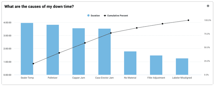
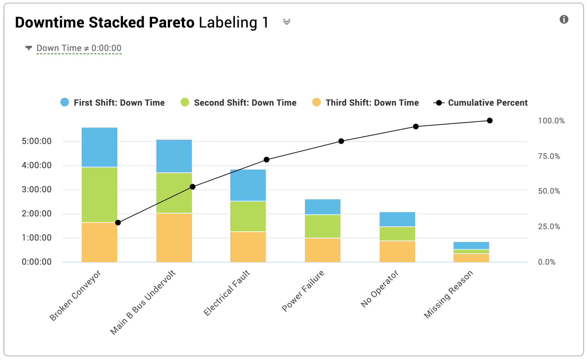
Downtime Pareto charts are a classic method of visualizing downtime - and one of the most requested charts. Pareto charts rank metric values from largest to smallest (the columns) and show how each category contributes to the whole (the line).
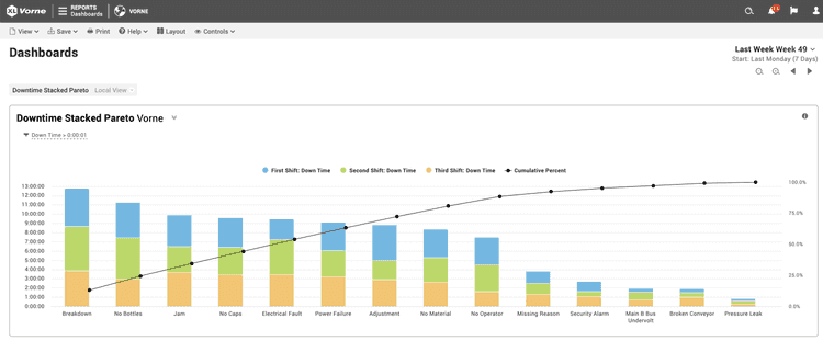
A downtime Pareto ranks accumulated downtime by reason within a selected timeframe and shows how each reason contributes to the total downtime. This creates a compelling visual and a very clear picture of your downtime. Pareto charts can also be used to show the impact of different data dimensions on downtime, such as this example of a downtime Pareto stacked by shift.
Total Production Timeline™
The Total Production Timeline™ (TPT) is particularly effective for diagnosing underlying issues associated with downtime. This data visualization shows how different types of events impact downtime. The TPT depicts the state of your process over time - using color. By also showing other time-correlated dimensions such as part changes and shift changes, you can see how different events affect production.
The TPT is easily scannable for patterns in your data. It is best used for shorter time periods such as a shift or a part run so you can clearly see patterns, such as:
- Breaks – Periods of downtime (red) before or after breaks (blue) can suggest extended breaks rather than true downtime.
- Shifts – Periods of downtime at the beginning or end of a shift can indicate a rough or late start or an early end to a shift.
- Changeovers – Patterns of downtime immediately after a changeover (amber) often indicate a problem with the changeover.
- Part Runs – Patterns of poor running (light green) after starting new part runs typically indicate opportunities to improve startups.
Downtime and Top Loss Reporting
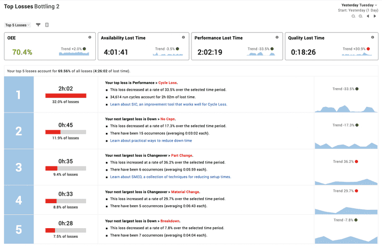
In XL, the Top Losses report ranks all production losses from largest to smallest, placing downtime in the context of the Six Big Losses (unplanned stops, planned stops, slow cycles, small stops, startup rejects, and production rejects) and showing where time is actually being lost. Every loss is represented the same way in the Top Losses report - as lost time. This makes it possible to accurately stack rank every loss by its impact to OEE.
The Top Losses report is very impactful because one of the fastest ways to improve manufacturing productivity is to relentlessly focus on your largest sources of loss. Particularly, ones where you have concrete ideas on how to mitigate the loss. In other words, focus your attention on the smallest set of improvement actions that will yield big results.
Although downtime loss is typically larger than performance loss, slow cycles and small stops are often larger sources of lost time than individual sources of downtime (i.e., reasons). Thus it is very helpful to see all losses within the context of one Top Losses report.
Top losses can be quickly attacked using the track, pick, fix method. Track production losses accurately. Pick the biggest actionable loss. Fix it. Repeat.
Downtime Dashboards
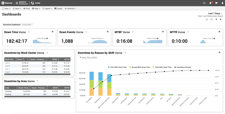
Downtime dashboards combine visualizations to tell a larger story. They enable you to create an unlimited number of perspectives from the data collected from downtime tracking software. For example:
- Operators can take advantage of real-time data to improve the course of the shift. Often this visualization is presented on a plant floor scoreboard.
- Supervisors can view short-term historical data and compare work centers within their department to develop weekly and monthly improvement plans.
- Managers can view data across a longer timeframe, looking at trends and making comparisons throughout the entire enterprise to help them develop larger-scope strategies.
Downtime dashboards present different perspectives from the same underlying data foundation, creating consistency across all levels of your organization. This will result in improved decision-making and better aligned improvement actions - especially when used within a structured improvement program.
Real-Time Downtime Tracking Software
Another aspect of downtime tracking is leveraging and acting on data in real time. This is enormously important as it transforms reactive analysis into proactive action - reducing downtime in real time.
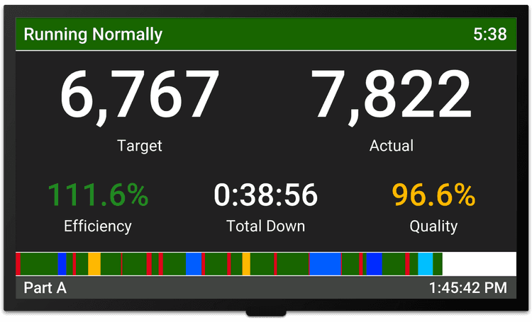
For operators, the goal is to clearly display the state of the process on the plant floor in real time. Earlier, we showed images of a down event as represented on a plant floor scoreboard. It is equally important to provide information about the shift while running. For example:
- Show downtime for the shift.
- Show good count relative to a target to motivate operators to win the shift.
- Show a timeline of the shift so supervisors walking the floor can visualize the shift.
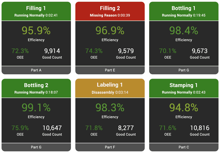
For supervisors and managers, a “digital Andon” view generated from real-time data can also be a valuable tool. Use color to draw instant attention where it is needed - such as downtime events. In this example, four lines are running normally, one is down, and one is in changeover. If the down event is longer than a few minutes, the supervisor may want to check in with their team and help them get the line back up and running. A natural extension is to generate push alerts in situations where you want to ensure proactive involvement from your production team. This transition from reviewing downtime after the fact to seeing it as it happens is what enables teams to respond immediately and make adjustments during the shift.
From Tracking to Improvement
When downtime is tracked consistently and made visible, it changes how teams interact with production. Operators can see the impact of stops as they happen. Supervisors can focus on the largest sources of loss. Managers can align improvement efforts around a shared set of data.
Over time, this creates a more consistent and measurable approach to improvement - where decisions are based on what is actually happening on the floor, not assumptions.
Downtime Tracking and the XL Platform
- If you are writing down downtime or estimating stops → move to automated tracking on the line so events are captured consistently and in real time.
- If you already have downtime data but it is hard to trust or act on → focus on data audits and making that data visible during the shift so your team can respond and improve as downtime happens.
With XL, both start at the same place - capturing accurate data directly from the machine and making it usable across your operation in real time.


